PiggyPenny
UX/UI design project
Personal finance app that helps users manage their money with confidence.
The focus was on a clean, intuitive interface, automated expense tracking, and personalized insights — all aimed at making daily money management simple, visual, and stress-free.
The Problem
In a world where digital payments have become the norm, many users — especially younger ones — struggle to keep track of their expenses and develop healthy financial habits.
With credit cards, automatic charges, and payment apps, money often seems to “disappear” without users fully understanding where it went.
Most existing apps focus on basic expense tracking but fail to provide real insights or guidance for saving. They're often cluttered, hard to use, and rely on tedious manual input.
The app was designed to offer users a simple, accessible, and smart tool for managing their daily finances.
By connecting automatically to the user’s bank account, it pulls in most of their financial data — including balance, expenses, income, recurring payments, and more — and presents it in a clear, friendly, and easy-to-digest visual format.
In addition, the app provides :
- Personalized saving tips
- Manual data entry options
- Tools to track financial goals
All of these features work together to give users real control over their finances — without complicated calculations or confusing analysis.
The Solution
Process
Target Audience
- Young adults at the beginning of their financial journey who’ve recently received their first credit card
- Individuals with specific financial goals (such as saving for a car, vacation, or home)
- Established families seeking a simple and clear way to manage their daily finances
Competitor analysis
We explored several competing apps in the financial management space, including:
- Family.Biz
- Moneytor
- Expense tracking apps
Key Insights from Competitor Analysis:
- Visual overload: Many screens are cluttered with numerous elements, tables, and graphs that are often confusing for the average user.
- Excessive scrolling and nested navigation: Information is spread across multiple screens, resulting in a fragmented and sometimes frustrating user experience.
- Overly uniform visual language: Neutral white backgrounds and a lack of visual hierarchy make it difficult for users to navigate and distinguish between different sections.
- Icons resembling social media: Some icons are not intuitive in a financial context, leading to confusion.
- Lack of guidance or actionable tips: Most apps fail to provide practical recommendations or helpful explanations for users.
Insights from Potential Users:
- Young users want to see the full picture at a glance.
- There’s a strong demand for automated insights, not just raw data.
- Many struggle to stick with financial apps due to a lack of simplicity and immediate value.
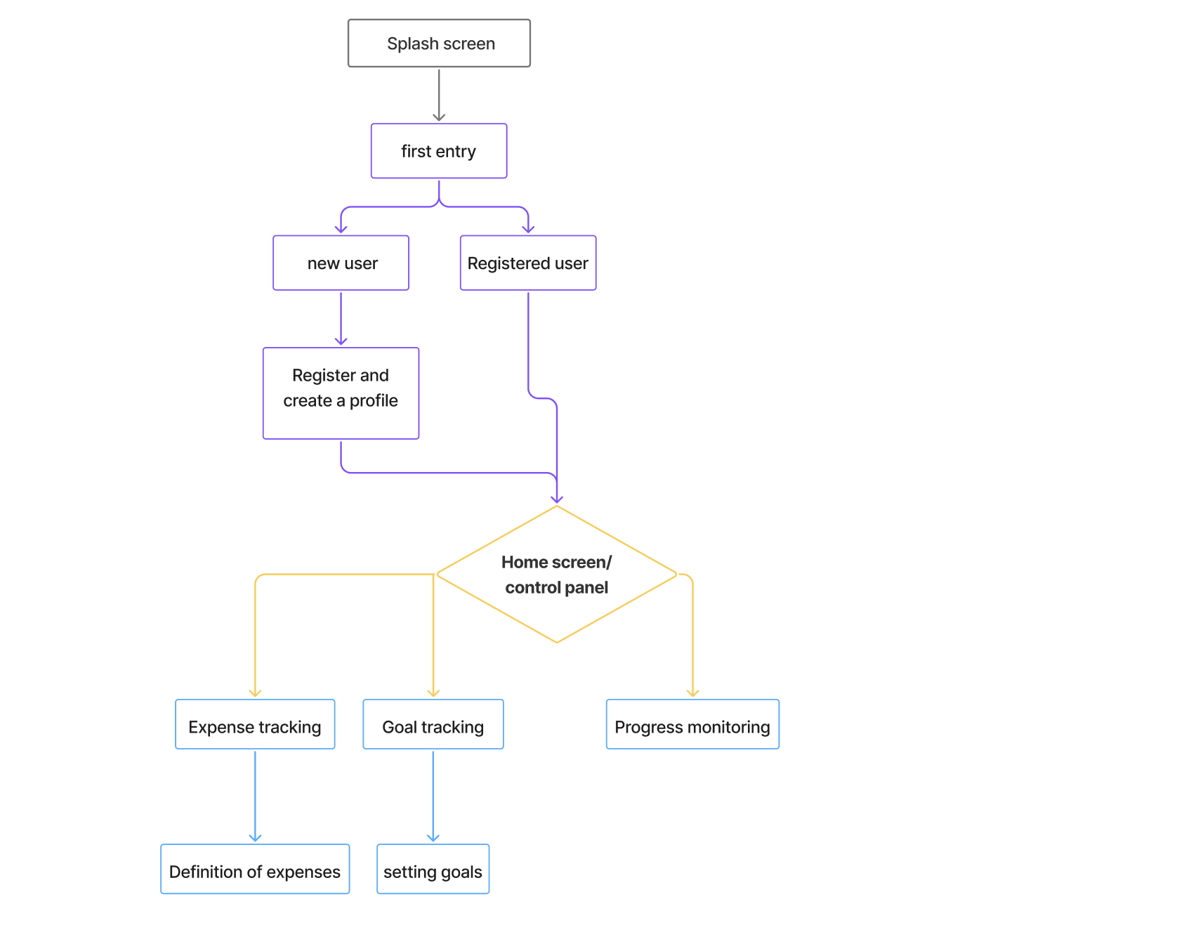
Flow chart

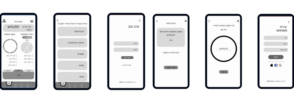
Wireframes

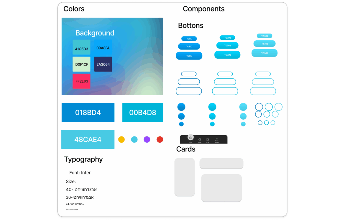
Design System

Application screens
